What Is the Fed Dot Plot? How to Read the SEP
A plain-English guide to the Fed's dot plot and the Summary of Economic Projections, with the June 17, 2026 release time and how to read the median dot.

Written with AI assistance; every figure is checked against our calculators and primary sources, and reviewed by Ethan Ginsberg before publishing.
The bottom line
The dot plot lands four times a year — the next one posts Wednesday, June 17, 2026 at 2:00 p.m. ET.
The Fed dot plot is a chart inside the Summary of Economic Projections (SEP), a document the Federal Reserve releases only four times a year. Each dot is one policymaker's anonymous estimate of where the federal funds rate should sit at year-end. The next SEP posts Wednesday, June 17, 2026 at 2:00 p.m. ET.
When does the next dot plot come out?
The June 2026 meeting of the Federal Open Market Committee (FOMC) runs June 16–17. The Federal Reserve publishes the policy statement and the SEP together at 2:00 p.m. ET on Wednesday, June 17, and the Chair holds a press conference at 2:30 p.m. ET. These dates and times come straight from the Federal Reserve's FOMC calendar (federalreserve.gov).
The SEP follows a fixed rhythm: March, June, September, and December, the four FOMC meetings that include updated projections. The other four meetings each year release a statement but no SEP and no dots. The dot plot is a quarterly event, not a monthly one.
What is the FOMC, and what is the federal funds rate?
The FOMC is the committee that sets U.S. monetary policy. It is made up of twelve members: the seven members of the Board of Governors, the president of the Federal Reserve Bank of New York, and four of the remaining eleven regional Reserve Bank presidents who serve on a rotating basis (federalreserve.gov).
The federal funds rate is the interest rate banks charge each other to lend reserves overnight. The FOMC sets a target range for it. That range sits at the top of the chain that eventually shapes what banks pay on savings and what they charge on loans. The effective federal funds rate, the actual traded average, is tracked daily by the St. Louis Fed (FRED series DFF).
What does each dot actually mean?
Every FOMC participant, a wider group than just the voting members, submits a projection of the "appropriate" year-end level of the federal funds rate. The dot plot stacks those projections as dots on a grid. The vertical axis is the rate. The horizontal axis is the year, usually the current year plus the next two or three, with a final column labeled "longer run."
The key word is anonymous. You can see that several participants expect a given level, but the chart never tells you which dot belongs to which person. It is a snapshot of opinion, not a promise or a vote.
Which dots should a reader focus on?
The Federal Reserve and most careful readers look at two reference points rather than any single dot:
| What to look at | What it tells you |
|---|---|
| The median dot | The middle projection for that year — half the dots are higher, half lower |
| The longer-run dot | Where participants think the rate settles once the economy is at a steady state (often called the "neutral" rate) |
The median matters because one outlier dot can sit far from the pack without moving the center. The longer-run dot strips out short-term conditions and shows the rate participants view as neither speeding up nor slowing down the economy.
The SEP also publishes projections for real GDP growth, the unemployment rate, and inflation (measured by PCE, the Personal Consumption Expenditures price index). The funds-rate dots are meant to be read alongside those numbers, not in isolation.
How is the dot plot not a forecast you can bank on?
The SEP states that each projection rests on each participant's own view of appropriate policy and the economic data available at the time. Conditions change between quarterly releases, and the dots move with them. A dot plot describes what participants think today, given what they know today. It is not a commitment, and this article makes no prediction about where any future dot will land or whether any rate path is good or bad.
How does the projected rate path reach your savings account?
The federal funds rate sits near the top of the rate chain. When it moves, the yields banks advertise on high-yield savings accounts (HYSAs) and certificates of deposit (CDs) tend to follow, though not instantly or one-for-one. The FDIC publishes national average deposit rates that show where typical accounts sit (fdic.gov).
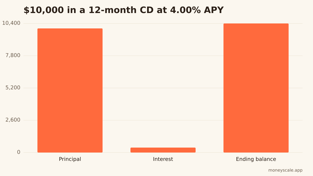
A CD locks a fixed annual percentage yield (APY) for a set term, so its return is set the day you open it regardless of where the funds rate goes afterward. APY is the yearly return including compounding. As an illustration, $10,000 in a 12-month CD at a 4.00% APY would grow to $10,400 — about $400 in interest. You can model any posted rate and term with the CD calculator using today's advertised numbers.
How do you read each quarter's release in five minutes?
The steps stay the same every quarter:
- Note the release date and time from the FOMC calendar.
- Find the current-year column and read the median dot.
- Compare that median to the prior SEP's median to see the direction of the shift.
- Check the longer-run (neutral) dot for the steady-state view.
- Read the GDP, unemployment, and PCE inflation projections next to it for context.
The official chart and the full table of projections are published on federalreserve.gov with each SEP release.
Sources
Related reads
How to Read the CPI Report: What May 2026 Means for Your Dollar
A plain-English guide to the Consumer Price Index, how the BLS builds headline and core CPI, and what the May 2026 release says.
Read itWhat the Fed's Rate Decision Means for Your Money
A mechanical guide to how the federal funds rate reaches your credit cards, HELOC, mortgage, and savings—pegged to the June 16–17, 2026 FOMC meeting.
Read itWhat Is an IPO \"Pop\"? SpaceX Opened Near $160 After Pricing at $135
SpaceX priced its IPO at $135 and opened near $160 on June 12, 2026. Here's what the gap between offer price and first trade actually means.
Read itIPO Lockup Periods Explained: Why Insiders Can't Sell New Stock Right Away
What an IPO lockup is, why underwriters require one, and where to read the exact terms in a company's SEC filing.
Read it
Money Scale Weekly
Read another one like this on Thursday?
We send one short, sourced money read per week. Tied to cd and the other Money Scale pillars. Free, no spam, one click to unsubscribe.
Drop your email and you're in. We send one short read on Thursday — and nothing else without your asking.